The history of colour is also a history of how we understand the relationship between the world and the human being who perceives it.

Plato and Aristotle: detail from Raffaello Sanzio - Raphael ‘s “The School of Athens” - 1511 fresco
Aristotle: colour between light and darkness
In ancient Greek natural philosophy, colour belonged to the visible and was not yet defined through wavelengths or numerical coordinates. It was approached through the qualities of things and their appearance to the senses.
Aristotle’s color theory shaped Western thought for centuries by proposing that all colors are created through the harmonious mixture of light (white) and darkness (black).
Writing in treatises like De Anima and Sense and Sensibilia, he argued that color is not an inherent chemical property of an object, but rather the boundary where a transparent medium, such as air or water, is actualized by light. He believed that colors had been “sent from the sky like rays of light.”
He linked these transformations to the four classical elements (earth, air, water, and fire), viewing color as a qualitative physical change.

Four elements,miniature from English medieval manuscript.
Fascinatingly, Aristotle believed that the most harmonious and beautiful colors are formed by precise mathematical ratios, explicitly comparing the blending of light and dark to the consonant intervals found in music.
He postulated that just as musical chords rely on simple fractions like 2:3 or 3:4 to sound pleasing, color combinations require specific numerical balances of light and dark to satisfy the human eye. This linear, organic framework ultimately viewed color as a dynamic spectrum of daylight, shifting fluidly from the blinding white of high noon to the deep black of midnight.
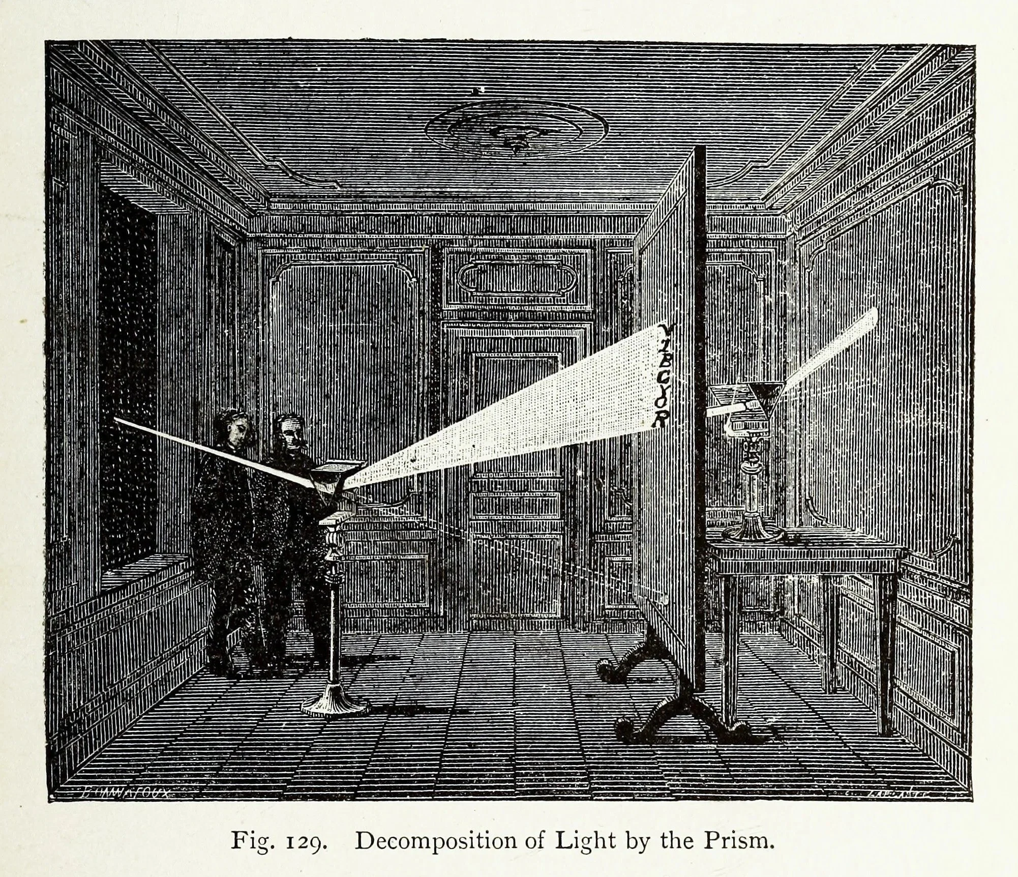
Edwin D. Babbitt, The Principle’s of Light and Color (New York: Babbitt & Co., 1878).
Isaac Newton: the discovery of the spctrum
This linear progression stands in stark contrast to Sir Isaac Newton's later 17th-century paradigm shift, which used a prism to prove that white light is actually a composite of all colors.
In the seventeenth century, Newton demonstrated that white sunlight could be dispersed by a prism into a spectrum of colours, and that these colours could be recombined to produce white light. This was a fundamental discovery in optics. Yet the prism also encouraged a particular way of imagining colour: as a collection of separate components that could be isolated, named and arranged into a system.
The danger arose when this optical account was taken as a complete explanation of colour itself.
The spectrum revealed something essential about light, but it did not exhaust the phenomenon of colour as it is experienced in nature.
The measurable properties of light and the lived appearance of colour are related, but they are not identical questions.
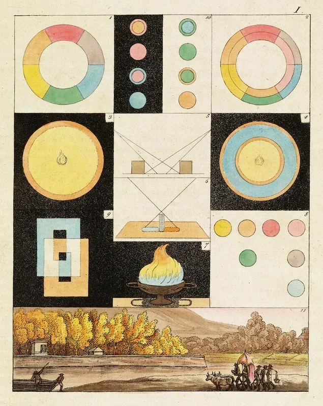
Goethe's colour Theory 1809
Johann Wolfgang von Goethe:
returning to the phenomenon
In his Theory of Colours (Zur Farbenlehre, 1810), Goethe challenged the idea that colour could be understood adequately by separating light into its spectral components.
He returned to the phenomena as they appear to the human eye: coloured edges, atmospheric appearances, afterimages and the changing relationship between brightness and darkness.
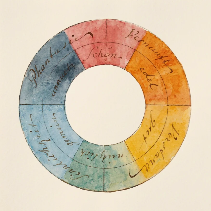
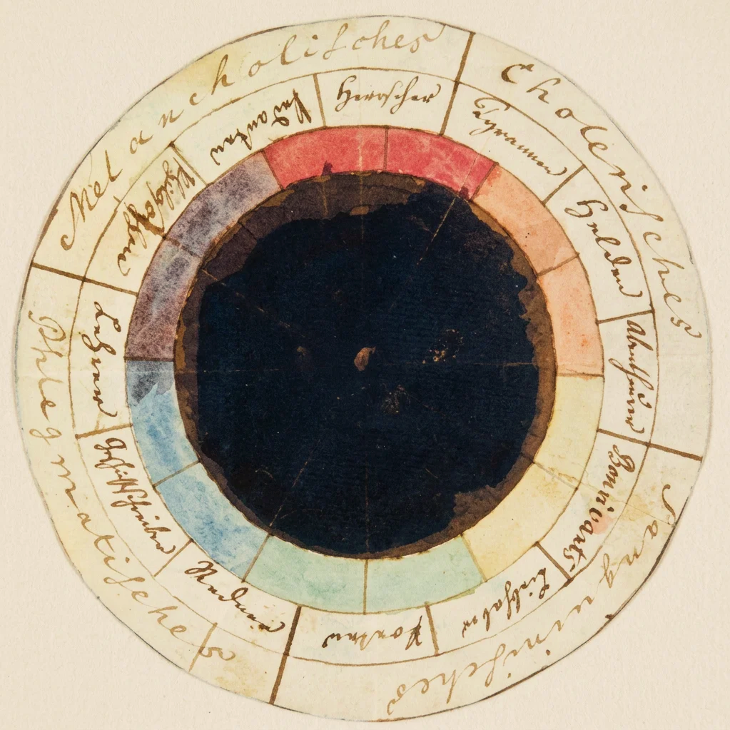
Goethe's colour wheel, created in 1809, - chapter “Allegorical, symbolic, and mystical use of colour” in Farbenlehre (1810)
The “rose of temperaments” (Temperamentenrose), a study from 1798/9 by Goethe and Schiller,
matching twelve colours to human occupations and character traits
(tyrants, heroes, adventurers, hedonists, lovers, poets, public speakers, historians, teachers, philosophers, pedants, rulers),
grouped in the four temperaments
Goethe's alternative account did not replace Newton's physical theory of the spectrum. His enduring contribution was methodological: he insisted that we observe colour in its actual conditions of appearance, including the role of the eye, the surrounding environment and our inner landscape.
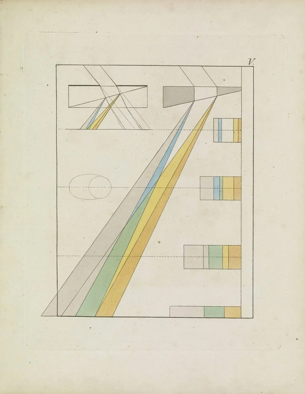
For Goethe, color does not exist inside white light; rather, color is the suffered child born at the boundary where Light meets Darkness through a turbid medium.
He gave us a living, relational model by organizing colors into a circle based on "plus" colors (yellow, red-yellow, allied with light, action, and warmth) and "minus" colors (blue, blue-red, allied with darkness, passivity, and cold). His approach proved that our eyes actively participate in creating color harmony, such as producing complementary after-images, turning color study into a living relationship between the world and human perception.
The human being returned to the centre of the investigation not as a subjective disturbance to be eliminated, rather as the perceiving participant through whom the phenomenon becomes experience.
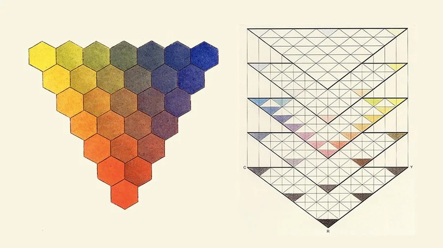
Tobias Mayer's color triangles.
Tobias Maye’s Affinity
In a quest to create a unified notation for color, like we know it from musical notation, artists soon started depicting the color spectrum as 3D solids. A concurrent example of this can be found in Tobias Mayer’s color triangle from his book The Affinity of Color Commentary, published posthumously in 1775. Mayer sought to accurately define the number of individual colors the human eye can see, and this required him to add another dimension to represent the variations of brightness for each color. Mayer painted the corners of a triangle with the three traditional primary colors from painting – red, yellow, and blue – and connected the corners by mixing the opposing colors together. Unlike the traditional color circle, he created many variations of this triangle by stacking triangles of different brightnesses on top of each other. This made it possible to define a color by its position within a 3D space, a technique still used to this day. Mayer ultimately failed at creating a color model with perceptually uniform steps, as he did not understand the irregularities of the human eye.
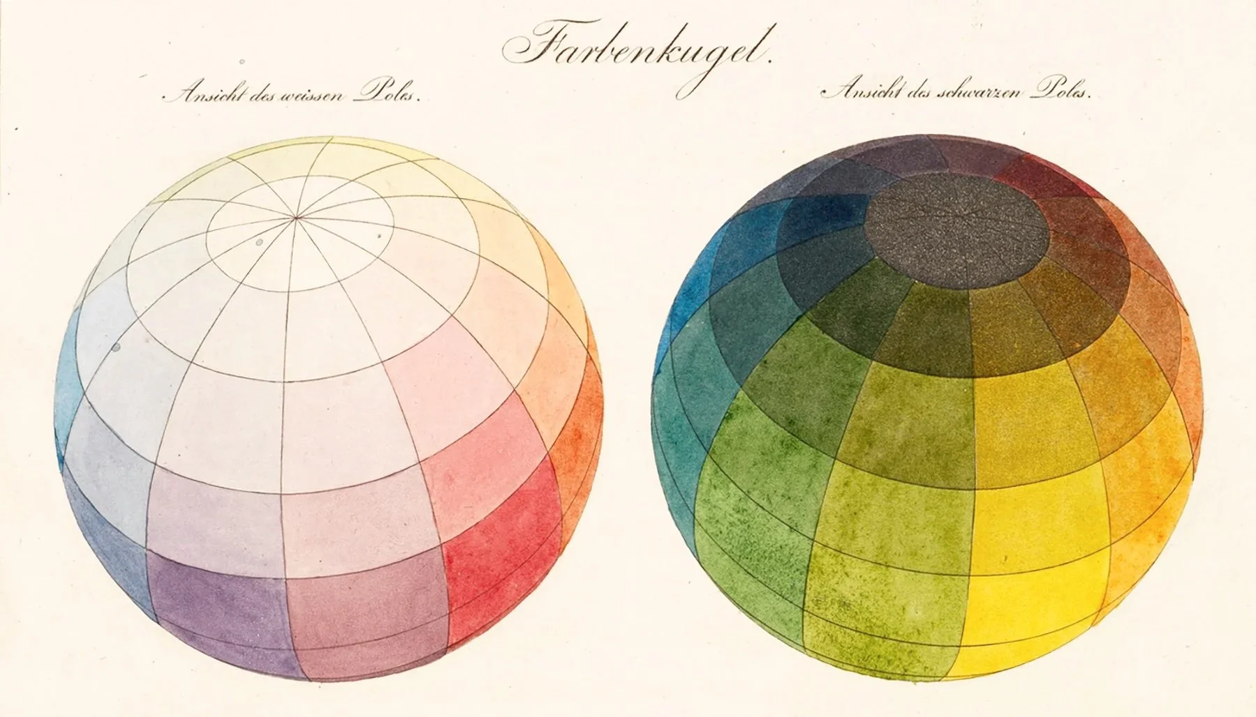
Philipp Otto Runge's color sphere.
Otto Runge’s Color Sphere
The German painter Philipp Otto Runge took this same approach when creating his spherical representation of the color spectrum, published in his Color Sphere manuscript in 1810. Runge’s sphere had white and black poles with colored bands running between them. However, like many other representations of color before it, the model did not differentiate between brightness and saturation, which meant that the resulting model had little variation in color intensity.
This sphere had the same problem as Mayer’s triangle, as the steps were not perceptually uniform
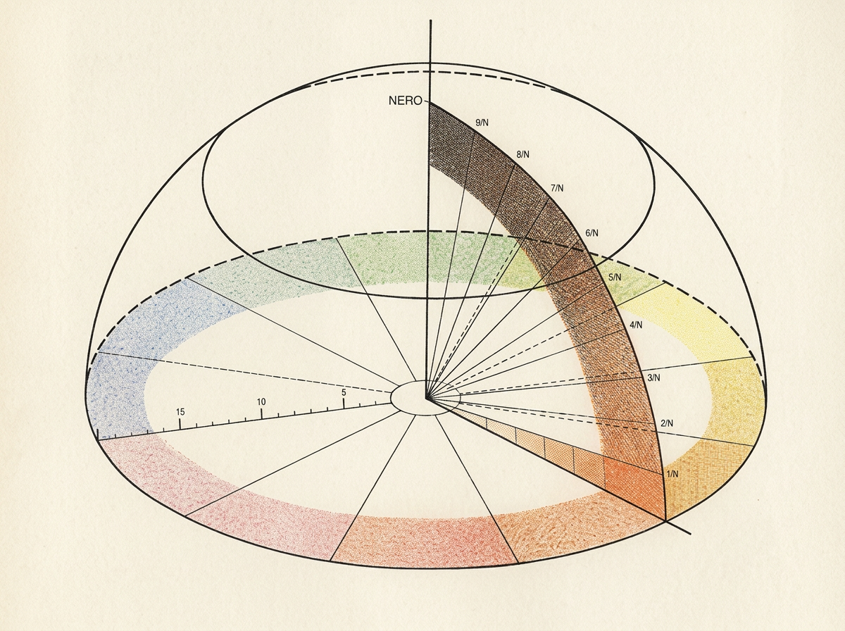
Michel Eugène Chevreul's color sphere.
Chevreul: the life between colours
In the nineteenth century, the chemist Michel Eugène Chevreul investigated how colours affect one another. His work on simultaneous contrast demonstrated that a colour's appearance changes according to its surroundings.
A grey may appear warmer or cooler beside different colours. A red may seem brighter, duller or altered in character depending on what stands next to it.
Colour cannot be fully understood in isolation. Its appearance depends upon relationship.

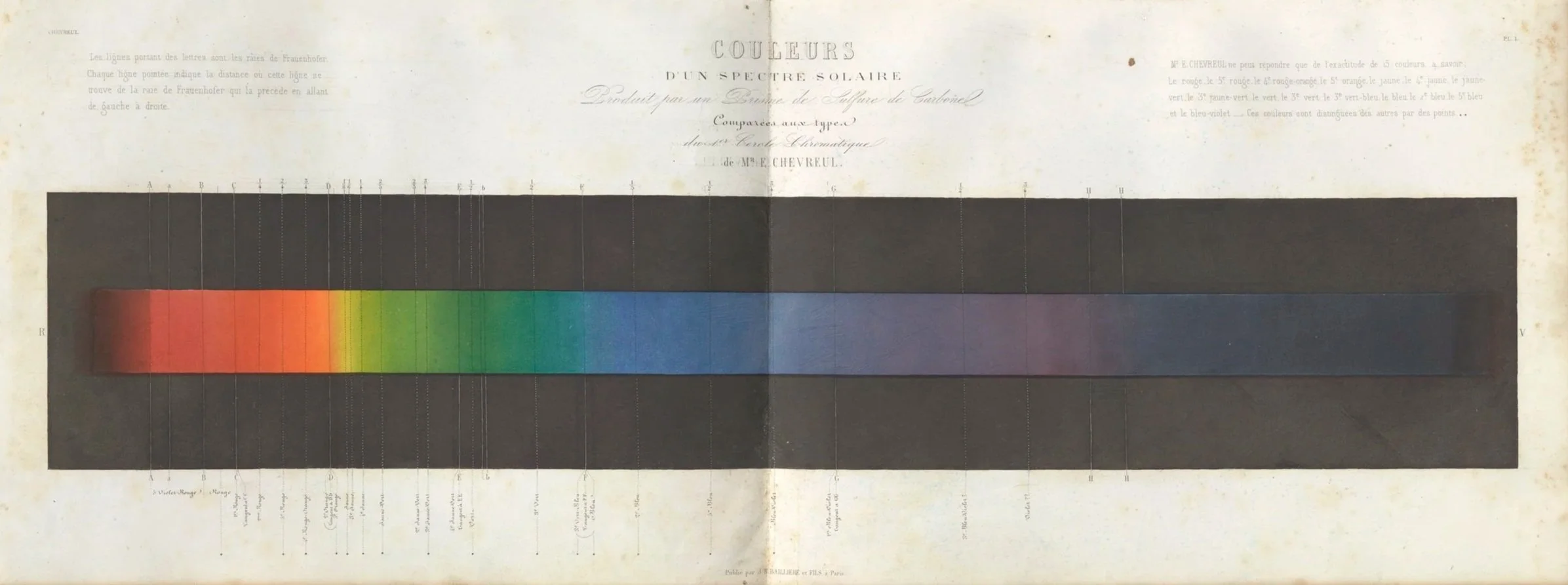
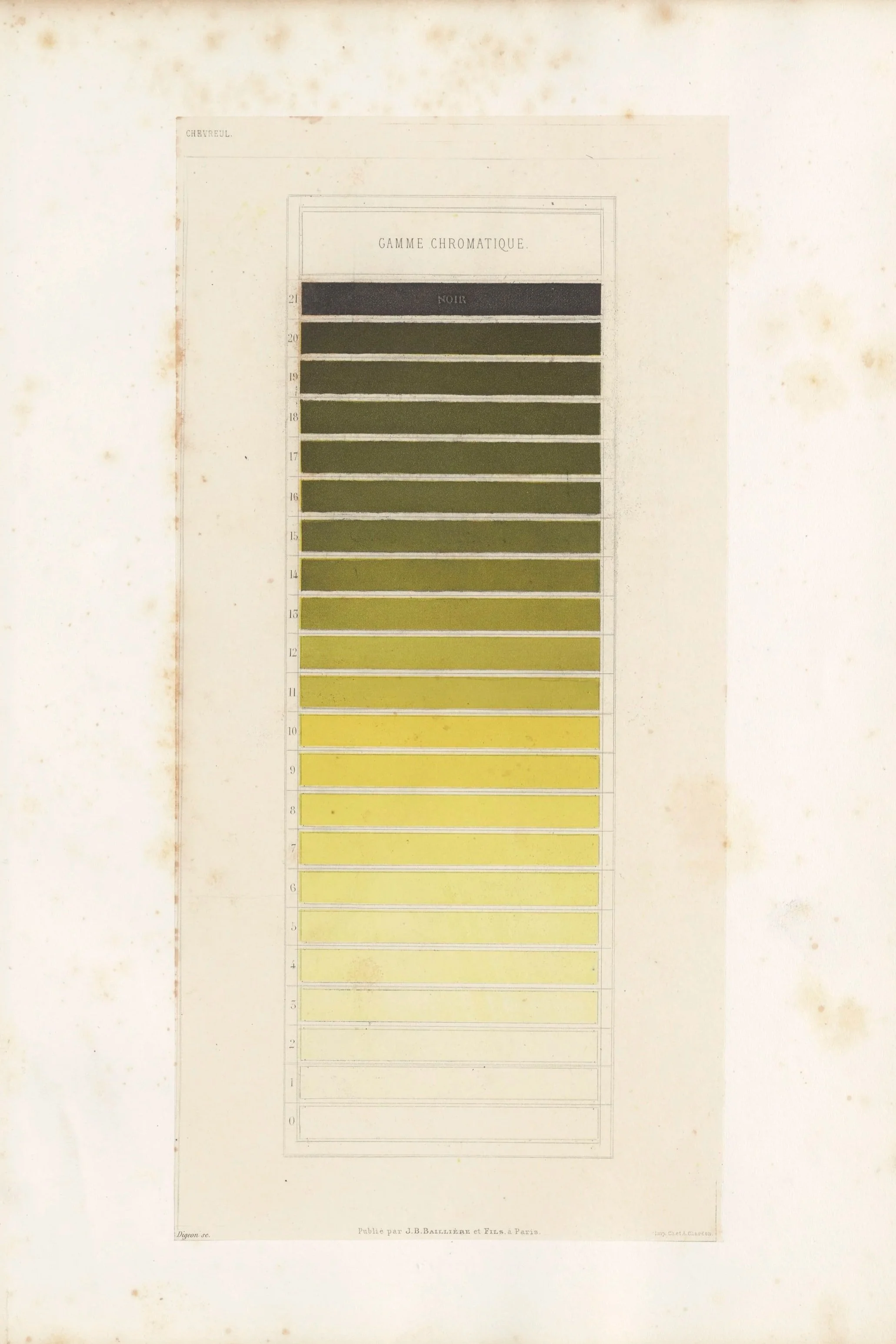
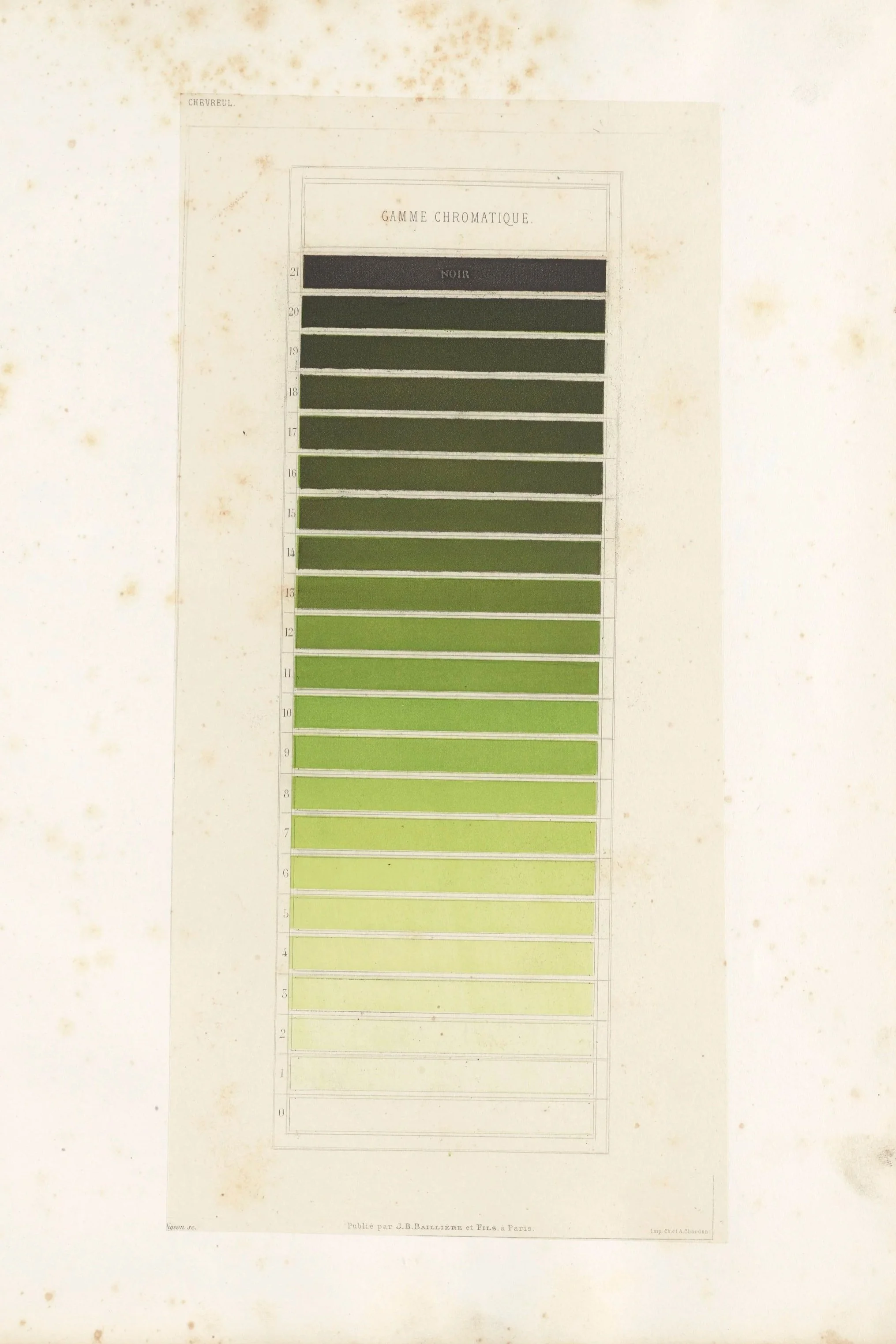
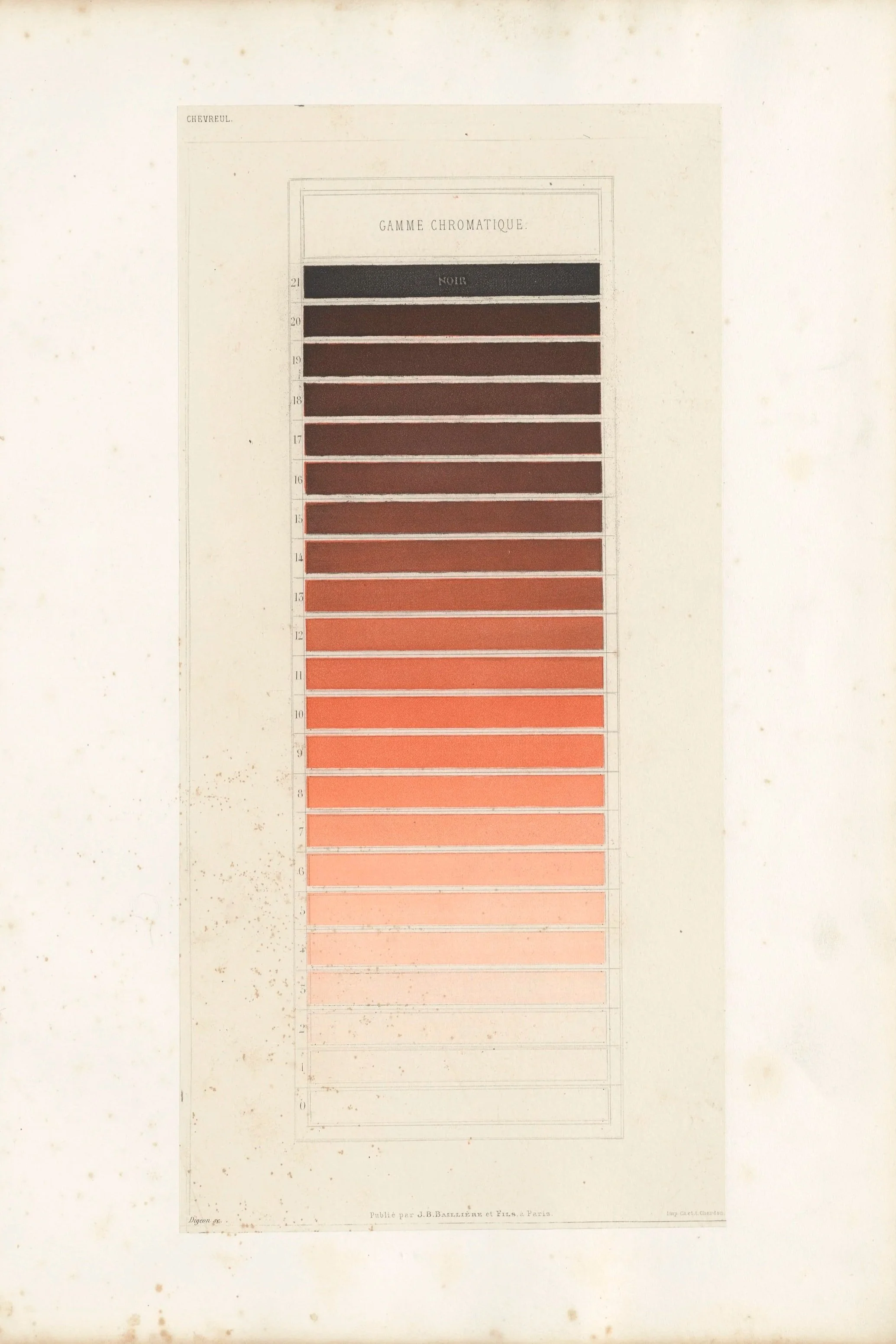
Michel Eugène Chevreul’s Of Colors and of their Applications in the Industrial Arts with the Help of Chromatic Circles - 1864
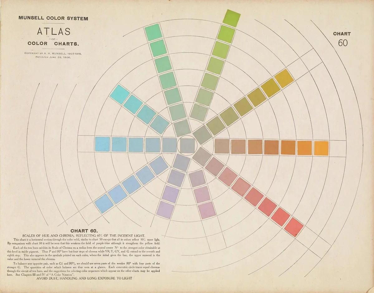
Painter and Art Teacher Albert Henry Munsell’s Atlas - 1915
Albert Henry Munsell:
making colour describable
At the beginning of the twentieth century, the artist Albert Henry Munsell developed a systematic model that describes colour through hue, value and chroma.
His system made it possible to identify and communicate colours with greater precision.
It remains valuable in art, education and technical applications.
Yet a colour system, however precise, describes selected characteristics of a colour; it does not necessarily tell us how that colour lives within a painting, changes in the landscape or affects our experience of space.
Classification can help us recognise colour. It cannot replace the act of seeing.
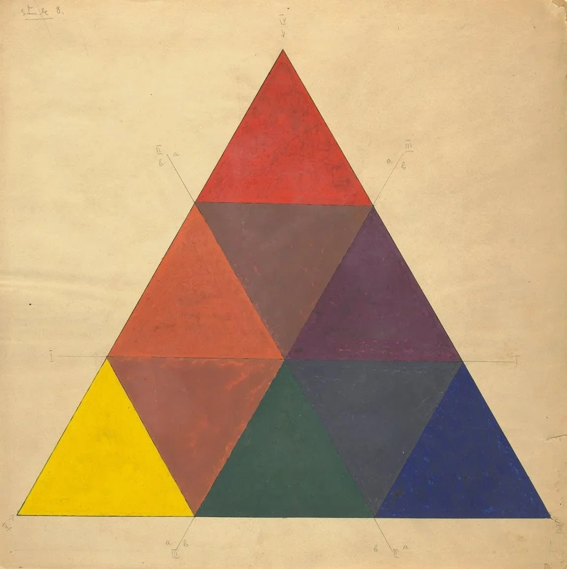
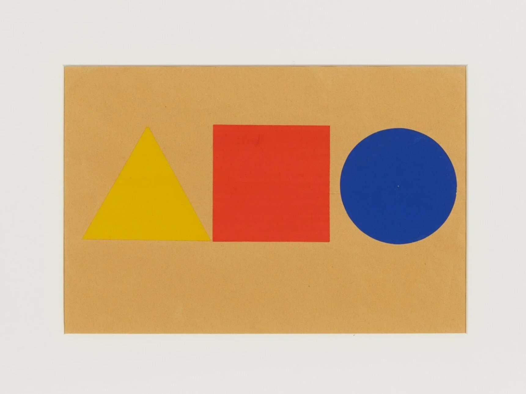
Wassily Kandinsky - Color triangle and Color exercices from his lessons
Wassily Kandinsky: Synesthetic Vibration and Spiritual Polarity (c. 1910–1920s)
Directly inspired by Goethe's prophetic formulations on polarity, Kandinsky liberated color from literal description and transformed it into a vehicle for the human soul. His approach was explicitly synesthetic and deeply psychological, operating on two main axes: the horizontal polarity of Warmth and Cold (yellow vs. blue) and the vertical polarity of Light and Dark (white vs. black). Kandinsky argued that colors possess "inner sounds" and spiritual frequencies: yellow is a sharp, aggressive trumpet blast that expands outward toward the viewer, while blue is a deep, concentric cello that retreats into itself like a snail.
By firmly marrying color to geometric shapes (yellow triangles, red squares, blue circles), he proved that color is a living, emotional force capable of triggering immediate psychological resonance.Wassily Kandinsky - Gelb-Rot-Blau (Yellow-Red-Blue)- 1925
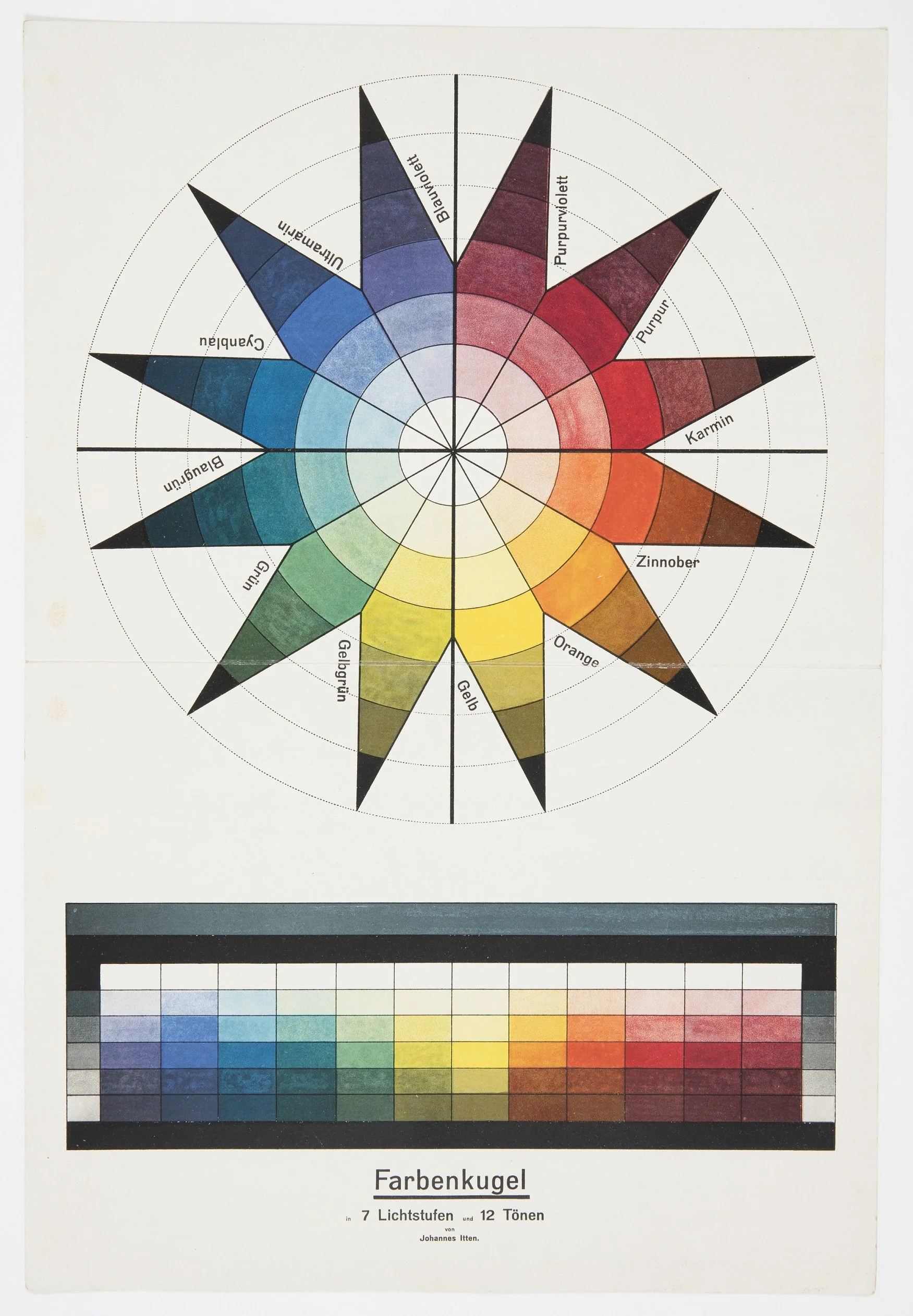
Farbenkugel von Itten (1921)
Johannes Itten :
colour as an artistic experience
At the Bauhaus, Johannes Itten developed a distinctive approach to colour education.
Itten took the fluid, psychological impulses of the era and provided the structural grammar needed to wield color as a living relationship.
Rather than classifying color by rigid wavelengths, he classified it by its behavioral interactions, formalizing the 7 Color Contrasts (including hue, light-dark, warm-cool, and simultaneous contrast). Itten observed that a color never exists in isolation; its apparent temperature, weight, and vibration change entirely based on its neighbor.
He also championed "subjective color," teaching that an individual’s internal disposition dictates their harmonic choices.
At the Bauhaus, Johannes Itten developed a distinctive approach to colour education. Through contrasts of hue, light and dark, warm and cool, complementary colours and saturation, he encouraged students to investigate the expressive and relational qualities of colour starting from his 12-color wheel.
Through his 12-part color star, Itten provided the bridge where systematic geometry meets the fluid, shifting reality of human emotion and visual relativity.
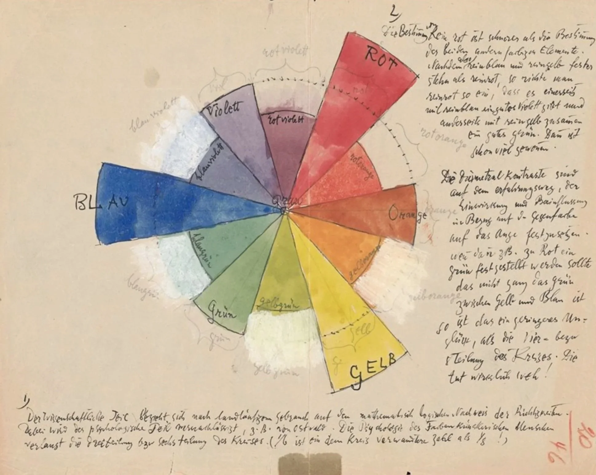
Paul Klee: The Kinetic Dialogue and Organic Movement (1920s)
While his contemporaries focused on contrasts and synesthesia, Klee viewed color as a living, breathing organism defined by kinetic energy, time, and growth.
Influenced heavily by Goethe, Klee rejected static diagrams and treated the canvas as a dynamic field of energy where color is constantly in motion.
He analyzed color through fluid gradations, weights, and temperatures, demonstrating how tones shift, bleed, and generate space and rhythm like musical counterpoints.
For Klee, the center of all color theory was a "gray point": a living nucleus of chaos and potential from which all vibrant color relationships emerge and to which they must eventually return to find balance. Under Klee’s lens, color classification completely dissolved into an organic, structural language of pure transformation.

Rudolf Steiner - pastel or watercolor
Rudolf Steiner : the essence of colour
In his lectures collected as The Essence of Colour (GA 291), Steiner develops Goethe's phenomenological approach into an artistic and spiritual exploration of colour.
In the lectures of May 1921, he asks us to remain within the experience of colour itself, rather than reducing it entirely to an abstract explanation of light. He explores the relationship between the qualities of colours, their appearance in nature and their significance for artistic creation.
He describes color as: "Lustre" (Glanz) colors and "Image" (Bild) colors. Lustre colors (like yellow red and blue) are active, radiant forces that shine outward or draw us inward, while Image colors (like white, black, green and peach blossom) are static, fixed, and reflective. Rather than radiating their own light, they act as "shadows" or snapshots of the different kingdoms of nature and states of being.
In his wider reflections on light and darkness, Steiner also relates these qualities to human experience: light to the activity of thinking, darkness and weight to other dimensions of our being, including will, color to our capacity of feeling.
Colour becomes more than a physical property or an aesthetic effect. It becomes a way of encountering the relationship between the outer world and the inner life of the human being.
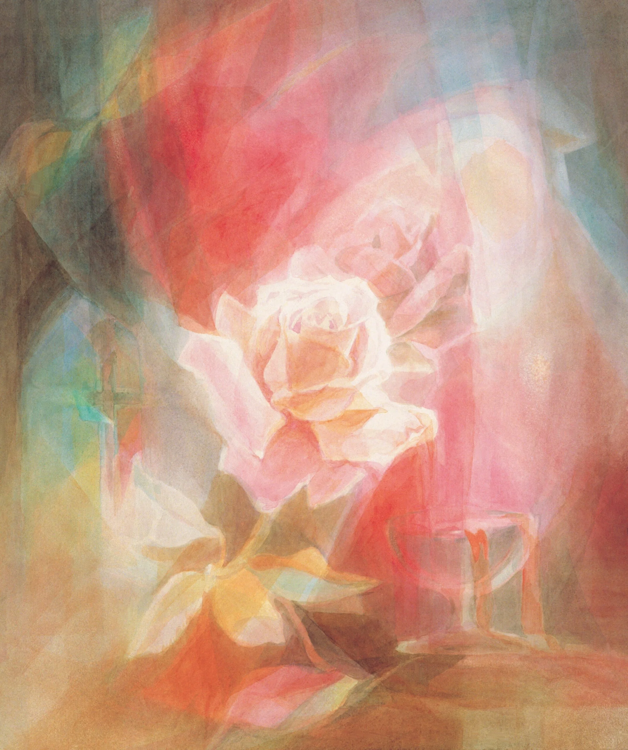
Liane Collot d’Herbois - Rose with chalice - thanks to Walter Schneider from SchneiderEditionen
Liane Collot d’Herbois:
colour as a living process
In the twentieth century, the artist Liane Collot d’Herbois brought together insights from Goethe's study of colour and Steiner's anthroposophical understanding of the human being in an approach that became therapeutic through her collaboration with the physician Ita Wegman.
Working together from the late 1920s until Wegman's death in 1943, they developed the foundations of a painting therapy in which colour, light and darkness were considered in relation to the human being as a whole.
In this approach, colour is not simply an expression of emotion, nor a symbol to be interpreted according to a fixed dictionary. Its qualities and movements become part of a deeper artistic and therapeutic observation.
Light and darkness are understood as active poles. Between them, colour reveals different gestures: opening and differentiating, gathering and deepening, moving towards manifestation or drawing towards inwardness.
The question is no longer only what colour is present, but how it behaves, what kind of space it creates and how its relationship with other colours changes the whole.
Color is no longer something to be classified or merely observed; it is a living, breathing force that can help us diagnose, rebalance, and heal the human harmony.
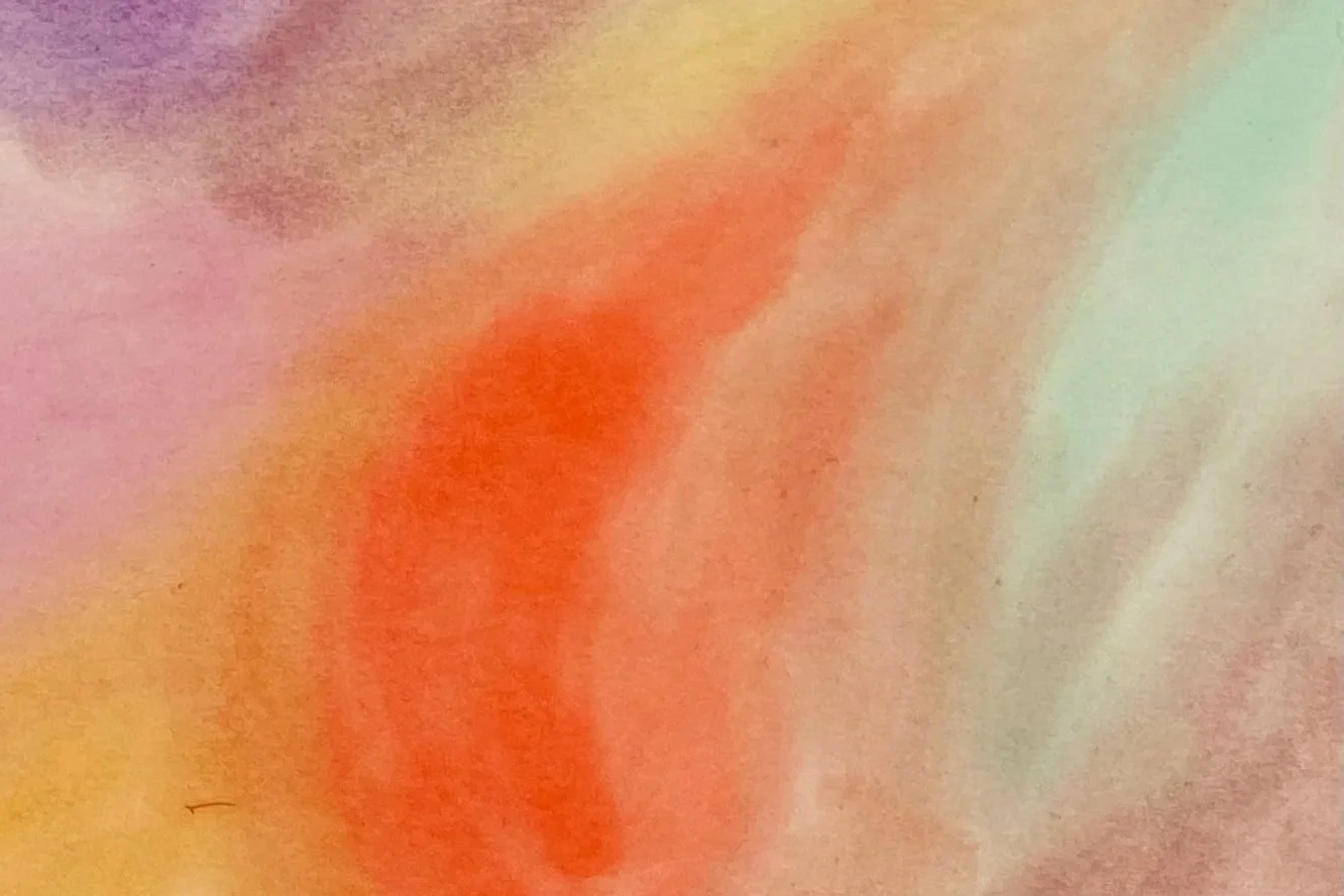
Color Exercise - Wet-on-Wet Watercolor
Colour as being.
The journey from Aristotle to Liane Collot d’Herbois reveals that color is not a static, mechanical property of the physical world to be captured and categorized, rathr a dynamic, living threshold where the universe meets human consciousness.
By breaking free from the rigid constraints of mathematical wavelengths and linear classification, this lineage transformed color into an interactive, phenomenological experience. What began as Aristotle's elemental struggle between light and shadow evolved through Goethe's sensory circles, vibrated through the spiritual and rhythmic spaces of Kandinsky, Itten, and Klee, and was elevated by Steiner into the realm of the soul. Ultimately, in the work of Collot d’Herbois, color is fully realized as a living, three-dimensional energy:
an expressive bridge between light and darkness capable of actively participating in human healing. This evolution proves that to truly understand color, we must stop merely looking at it, and instead learn to live within its relationships.